Aral sea dessication
Back in January I “reviewed” Fred Pearce’s “When the River’s Run Dry”, and in that I mentioned in passing the fate of the Aral Sea. Tonight I came across the Nasa Earth Observatory’s feature on the changes in the Aral Sea using Modis images. Just as I said back in January, I vaguely knew about this, and the detail was scary. However, it’s one thing to know something intellectually, and another thing altogether to know it emotionally - there’s something really immediate about pictures! So here are concatenated two images from the Nasa sequence: a map from 2000 and one from 2009 - with the 1960 shoreline shown for comparison. I reckon it’s truly stunning to see the change from 1960, to 2000, and on to 2009!
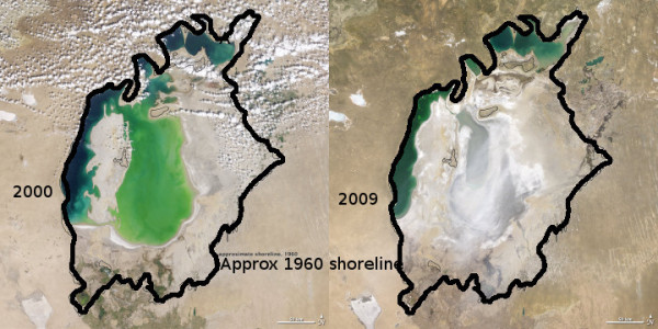
(For the record, these images were halved in size from the original using ImageMagick’s convert -size function, then concatenated using convert a.jpg b.jpg +append output.jpg, and then I crudely drew over the top of the Nasa shoreline using the Gimp, so it was clearer in these reduced resolution images, before a final shrinkage.)
comments (2)
Neil (on Wednesday 17 June, 2009)
Is there a calculation in terms of volume? The cloud cover on the 2009 image makes it difficult to compare.
Bryan (on Wednesday 17 June, 2009)
I’m not aware of one (but haven’t looked). You can go to the original at the NASA link and click on the 2008 map … you can see that much of the obscured region looks like salt flats!