ukcp09
One of the things that happened while I was away as the release of the latest UK climate predictions. This was (and is) a relatively big deal! While some have griped about the apparently unrealistic level of detail, the reality is that we do have to provide our very best predictions of climate over the next century, and we have to do it at the highest resolution we can. Of course there are caveats, but given we’re all convinced that the status quo is no longer a good predictor of the future, then we have to do better. Hence this government initiative which has run for a number of years to fund the running of ensembles of high resolution predictions, to come up with probably estimates of the future, and to produce a website so that prospective users can tailor the predictions to their own backyard. We’ve been responsible for the last bit!
There are multiple levels to the information on the web, but deep down in the technical site, there is a user interface that allows you to tailor plots to your own backyard. A team of folk at CEDA have been beavering away at that for a number of years building the infrastructure to underpin it, and this blog post is by way of my public thank you to that group of folk, who have worked long hours, to deliver a state of the art data manipulation and visualisation system. Newcastle University was responsible for much of the front end, but most of the hard yards, and the integration were done by our folk. The infrastructure was built on the knowledge we gained from ndg, exploits a raft of home grown, and specially customised OGC services, and runs on virtualised machines with all sorts of load balancing and monitoring goodness.
Over the next few weeks I’ll expose a few of the things that you can do with the UI, for now, a quick taster:
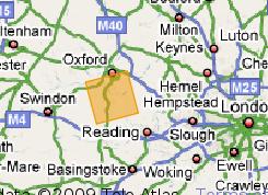
The results I’m about to show are for local summer (JJA) at my local grid-box:
I’ve got just two plots to show for today, and given the current hot weather, I’ve selected the “mean daily maximum temperature”, and how that will change for summer in the next thirty years, and the last thirty years of this century. (Change, with respect to a 1960-1990 baseline.) To really understand this stuff, you need to read the report guidance, not just look at the diagrams … but for now, like I say, a taster:
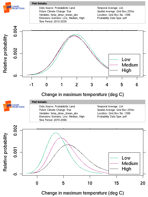
The key points to note are that,
- Regardless of which emissions scenario you think will pan out over the next thirty years, the likelihood is that we will have summers where the mean summer daily maximum temperature is going to be around two degrees hotter than it used to be …
- However, by the last thirty years of this century, choosing the emissions scenario really does matter. I’m pretty certain that six degrees as the average daily maximum increase could cause real problems here in England, it just wont be nicer finer summer days!
Now of course there are caveats to this sort of prediction, but for my money you’d be better betting on these sorts of numbers than on any hope for the status quo … and what that means is
- It is by no means too late to want to do something about our emissions (i.e. to mitigate against even more worrying future change), and
- In terms of adaptation now, these numbers are the best predictions that you’re going to get for a few years!
comments (1)
Harsha Vardhan (on Sunday 05 July, 2009)
Interesting post… waiting for the post that can detail more on how OGC services have been orchestrated with the NERC Data Grid.