What does a forecast icon mean?
Well, the forecast is beginning to go pear-shaped, although not through lack of heat … or perhaps not. Here are four MetOffice via BBC weather forecast snapshots, but I’m not really sure what they mean …
Firstly, here is a 24 hour forecast issued late Monday, followed by a five day forecast (today is Wednesday):
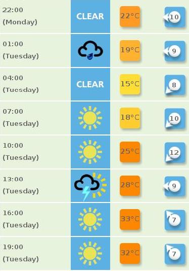
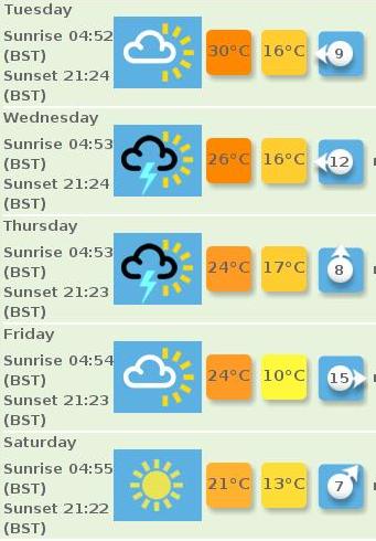
What’s interesting about this is that the 24 hour forecast makes it clear that the weather may be foul at some point during Tuesday … but the 5 day forecast average symbol (actually, I think the word on the website is “predominant”) … suggests sunshine. Me I think I would want to know in a five day forecast that rain and thunderstorms might occur. Mind you, the website states:
This is calculated based on a weighting of different types of weather, so if a day is forecast to be sunny with the possibility of a brief shower, then we will see a sunny or partly cloudy symbol rather than a rain cloud.
Well ok, at least they did explain the methodology, but compare this with today’s forecast:
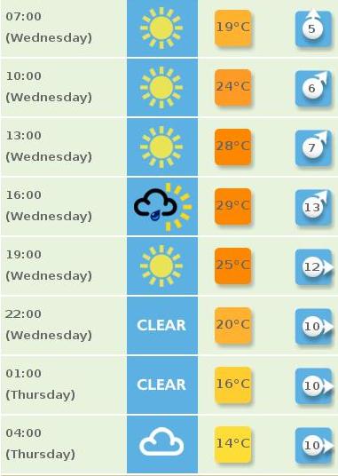
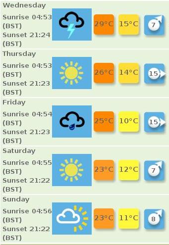
Now, the average symbol tells me what I want to know - risk of rain, but the 24 hour forecast makes it clear that it’s not expected to be a big part of the day. Now that does contradict what the website says, so there is an element of inconsistency here (unless we believe that there are thunderstorms between the sunny spells, since the hourly values appear to be instantaneous).
Leaving aside the fact that a look out the window suggests the average is more correct, one is left wondering what exactly what the algorithm is for constructing these things. (Clearly it’s autogenerated, because you can get these on a postcode basis).
We’ve spotted this sort of thing in the past, one day I must chase this up … because I’m getting interested in what folk expect out of climate forecasts.